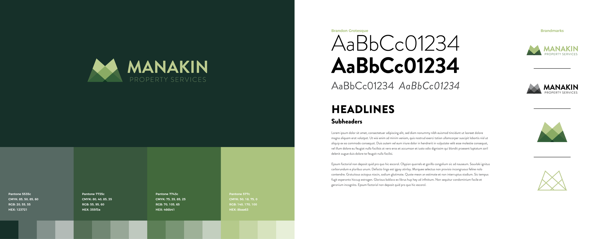
Manakin Property Services
Logo development
Concept 1: Landscapes
Concept 2: Geometric Mower
Concept 3: MPS Monogram
Brand Guidelines
Logo Concept 2 was the client favorite. Strong and contemporary, with a hidden touch of mowed grass stripes incorporated into the typography.
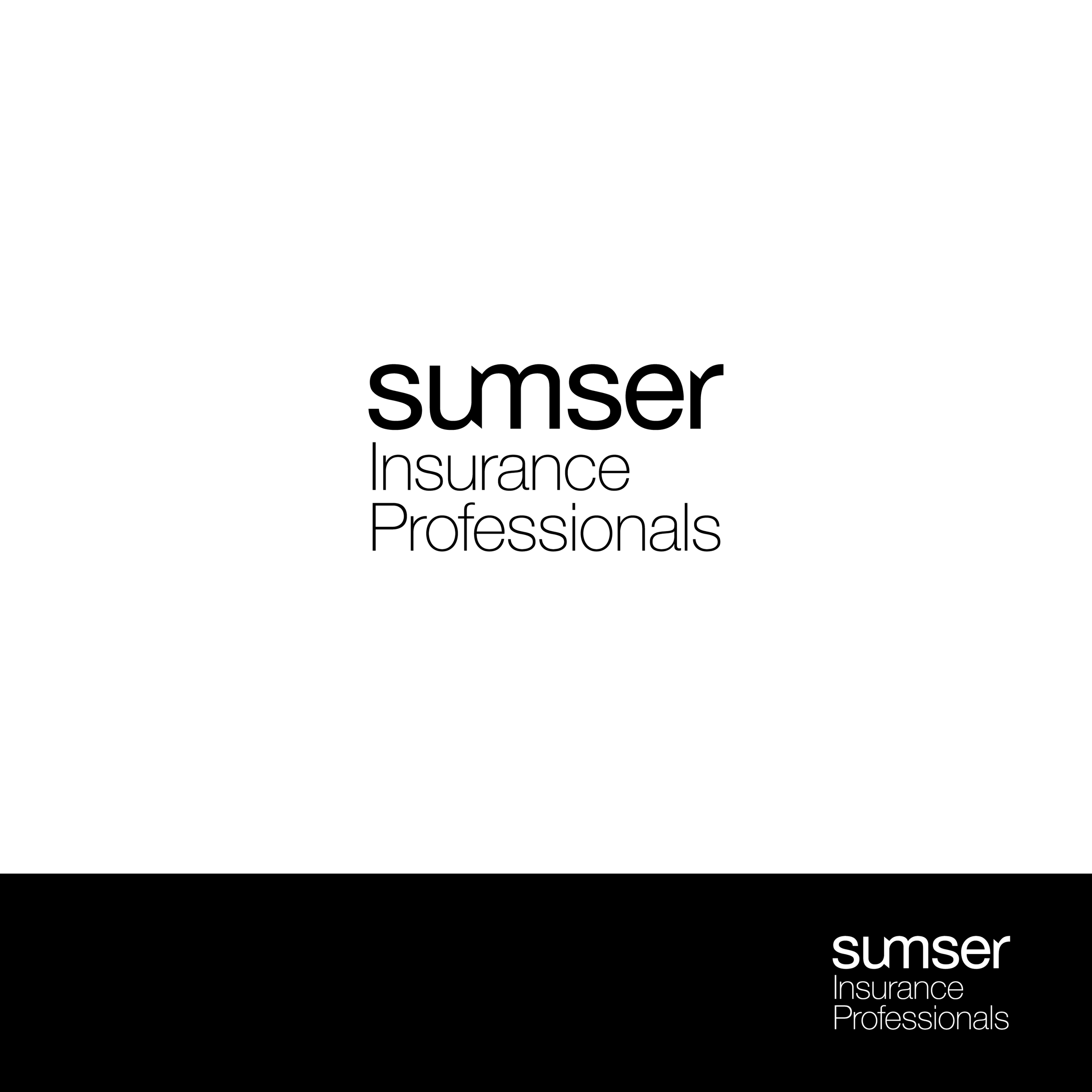
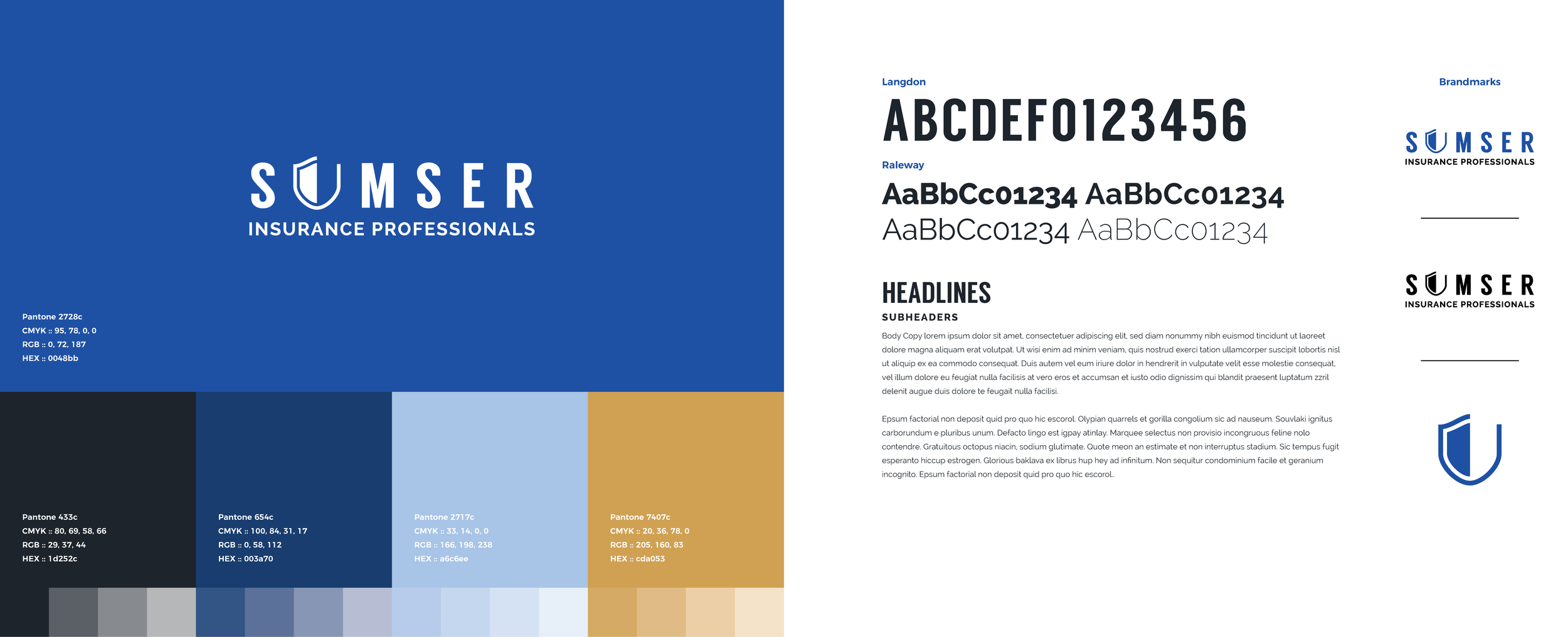
Sumser Insurance
Logo development
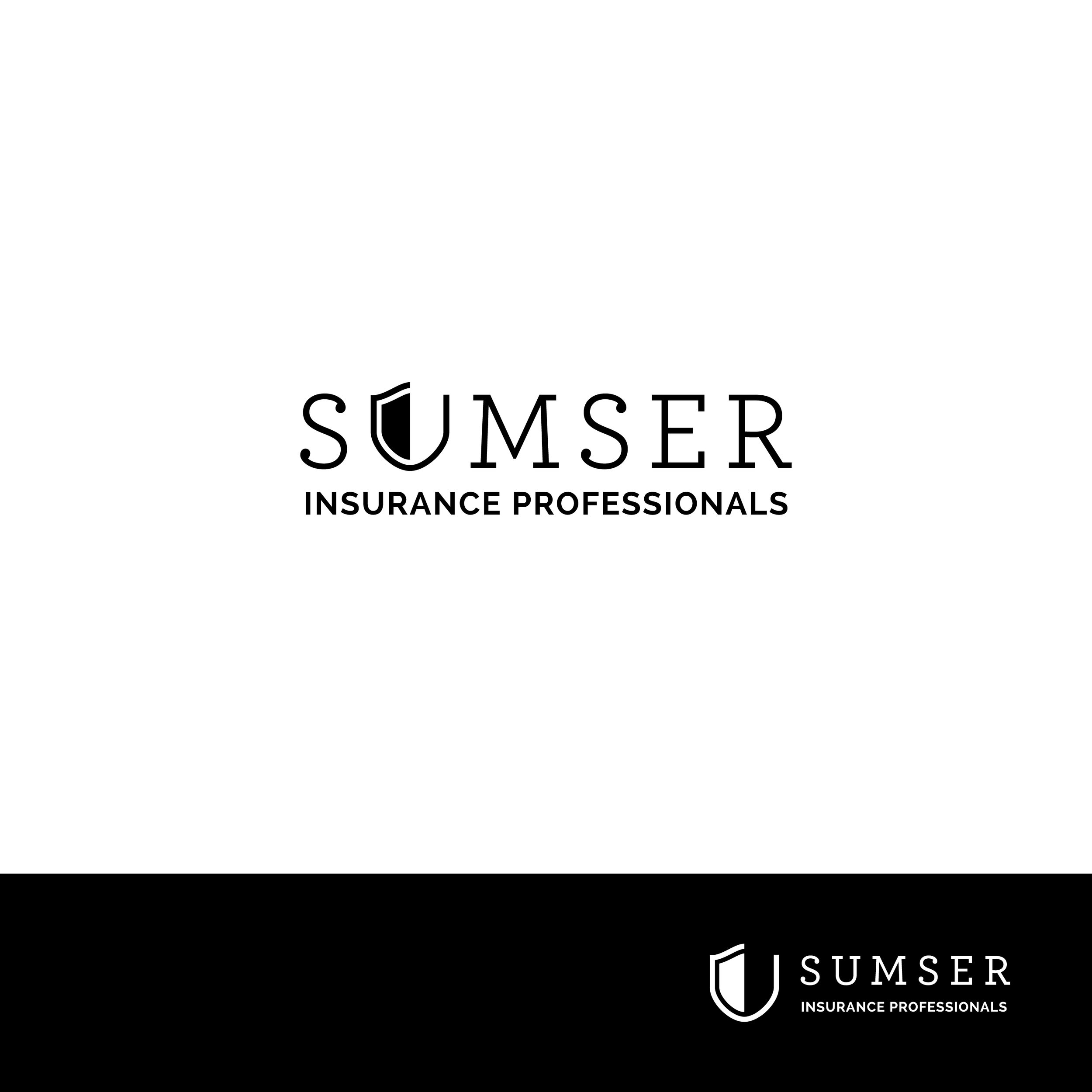
Concept 1: The Shield
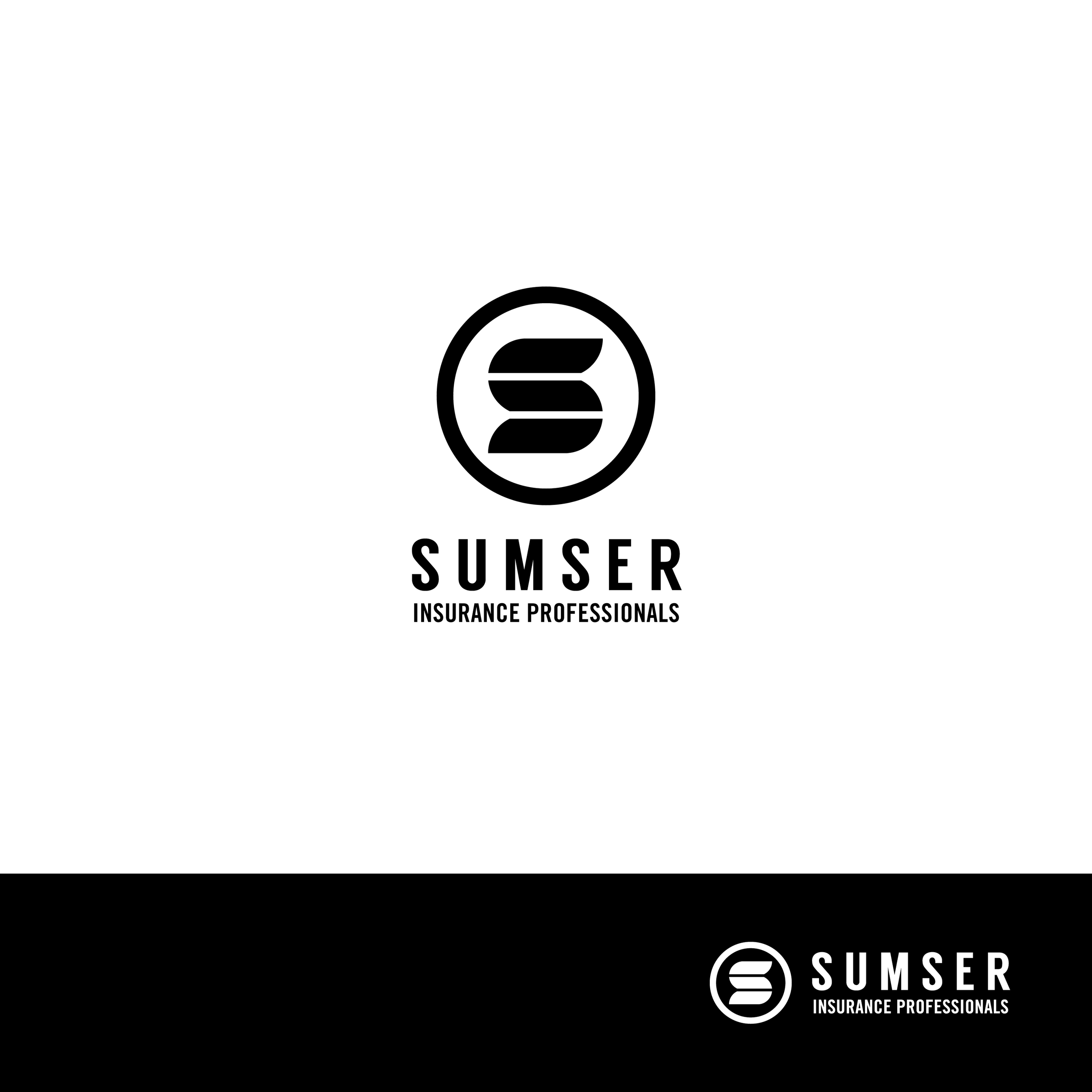
Concept 2: Full Coverage
Concept 1: Always Connected
Brand Guidelines
Concept 1 was our winner. With a few small tweaks and a bold color palette, we were ready to launch.
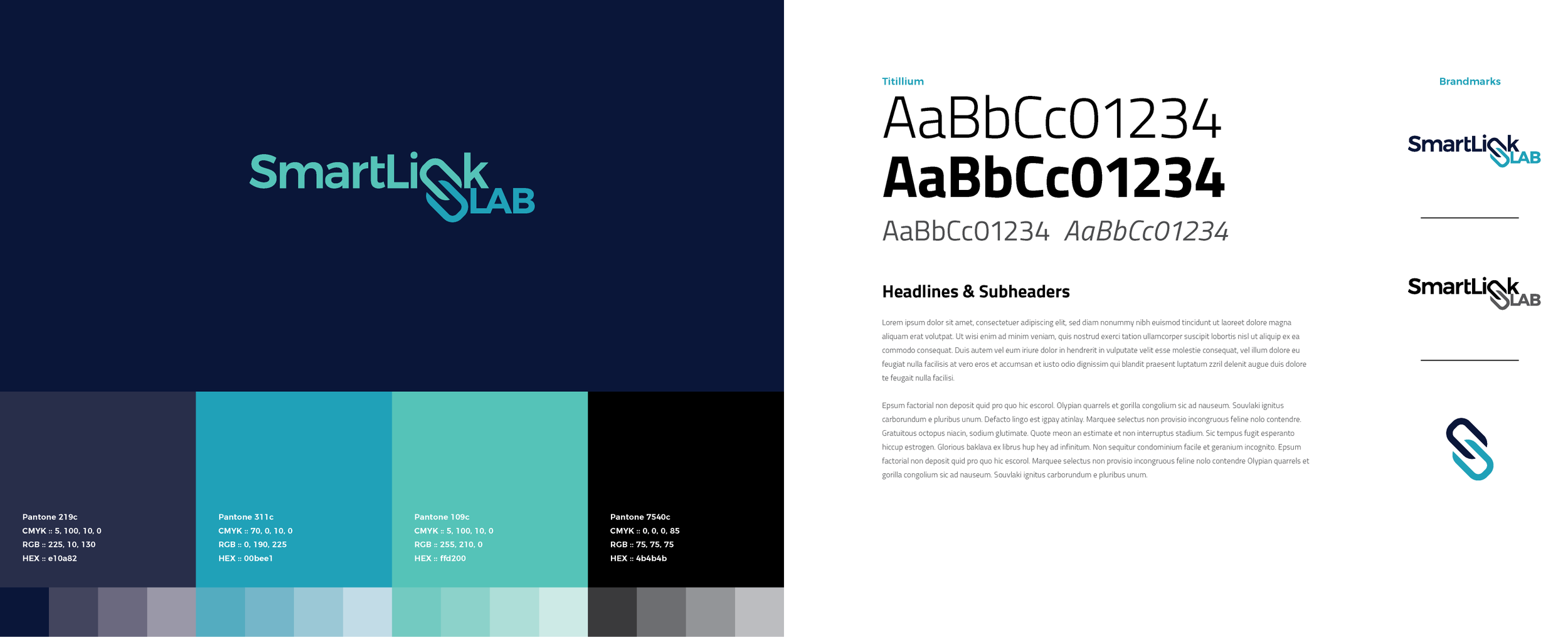
SmartLink Lab
Logo development
Concept 1: The Cube
Concept 2: Hexy S
Concept 3: Linked N
Brand Guidelines
After selecting Concept 3, our client chose to drop the 's' from 'Labs' and became SmartLink Lab.
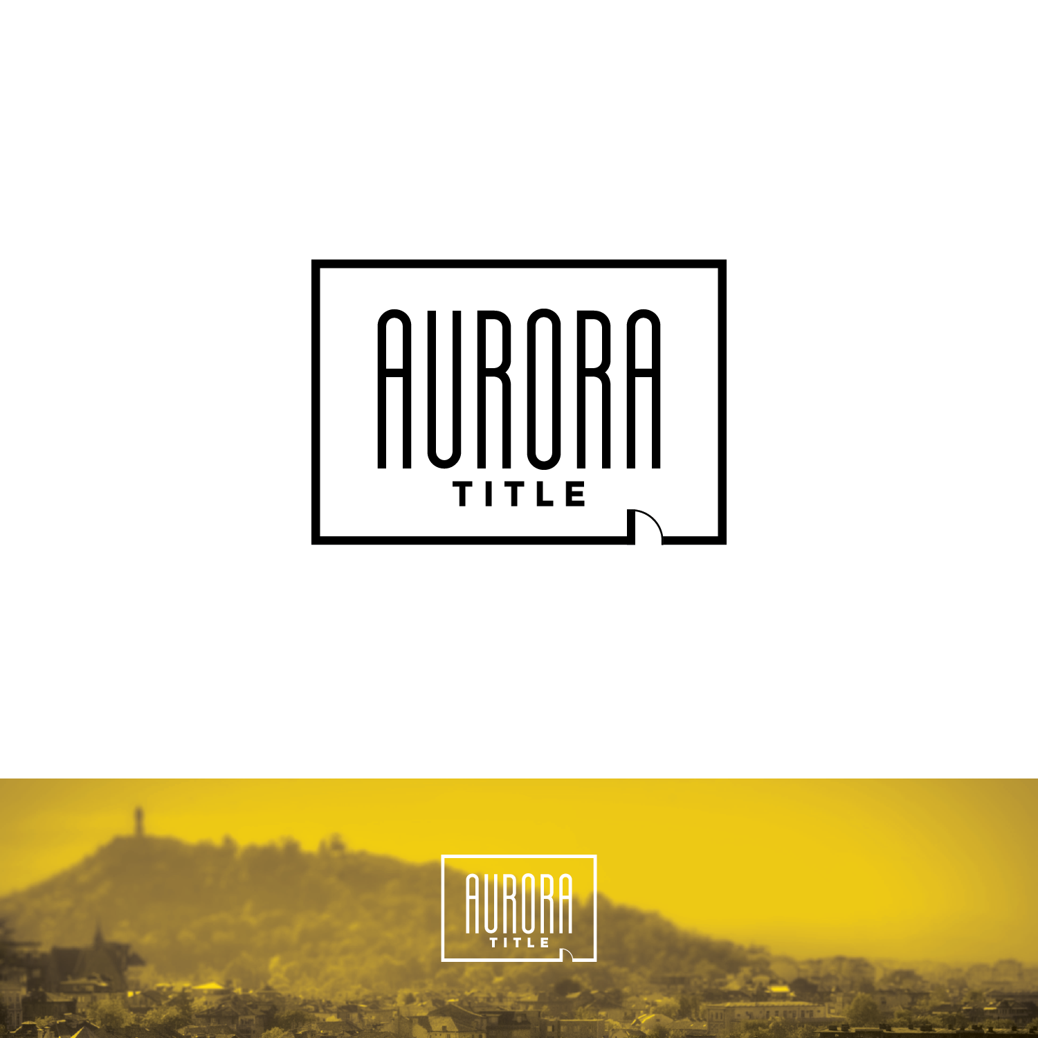
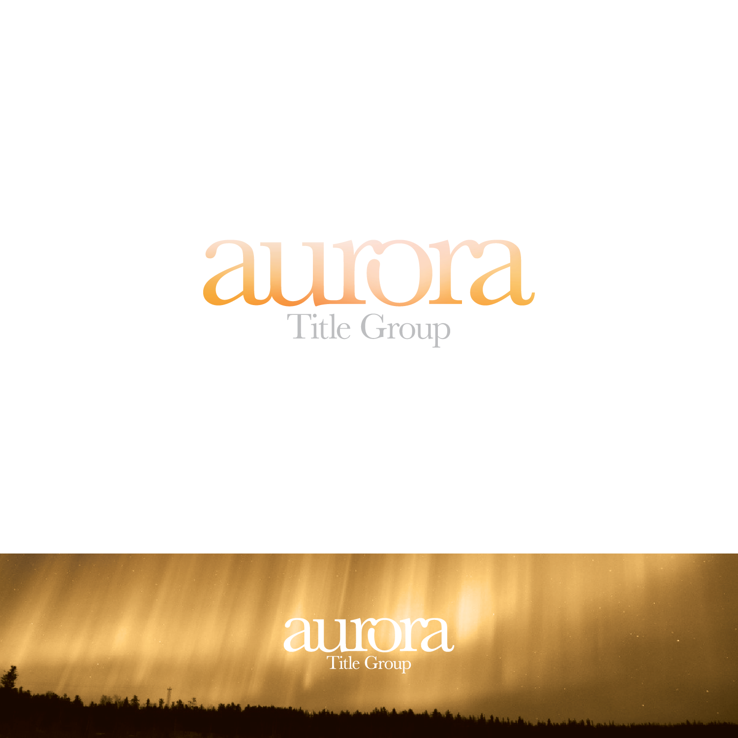
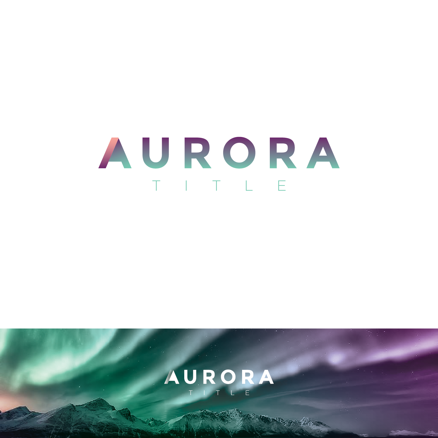
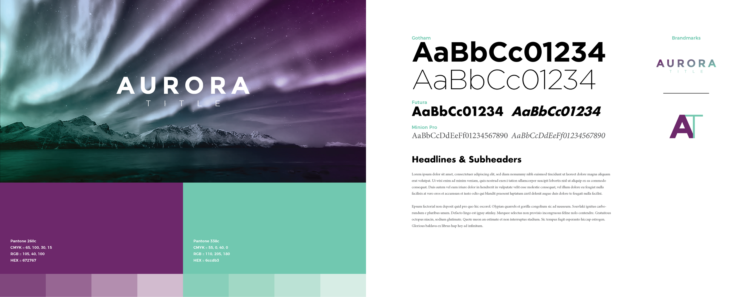
Aurora Title
Logo development
Concept 1: Welcome Box
Concept 2: Airy & Eerie
Concept 3: Cool Hombre
Brand Guidelines
After selecting Concept 3, our client chose to simplify the brand mark even further, using only the logotype.
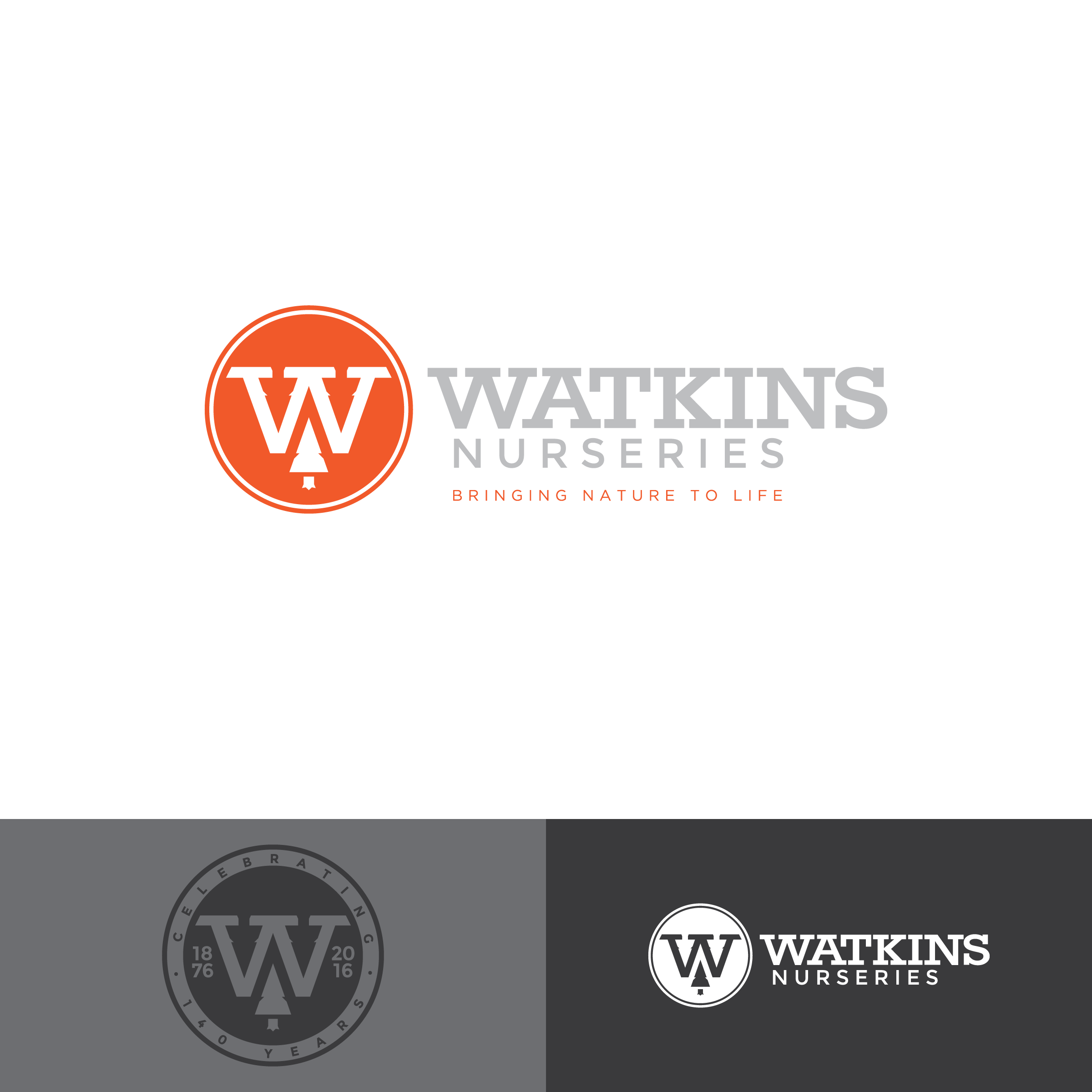
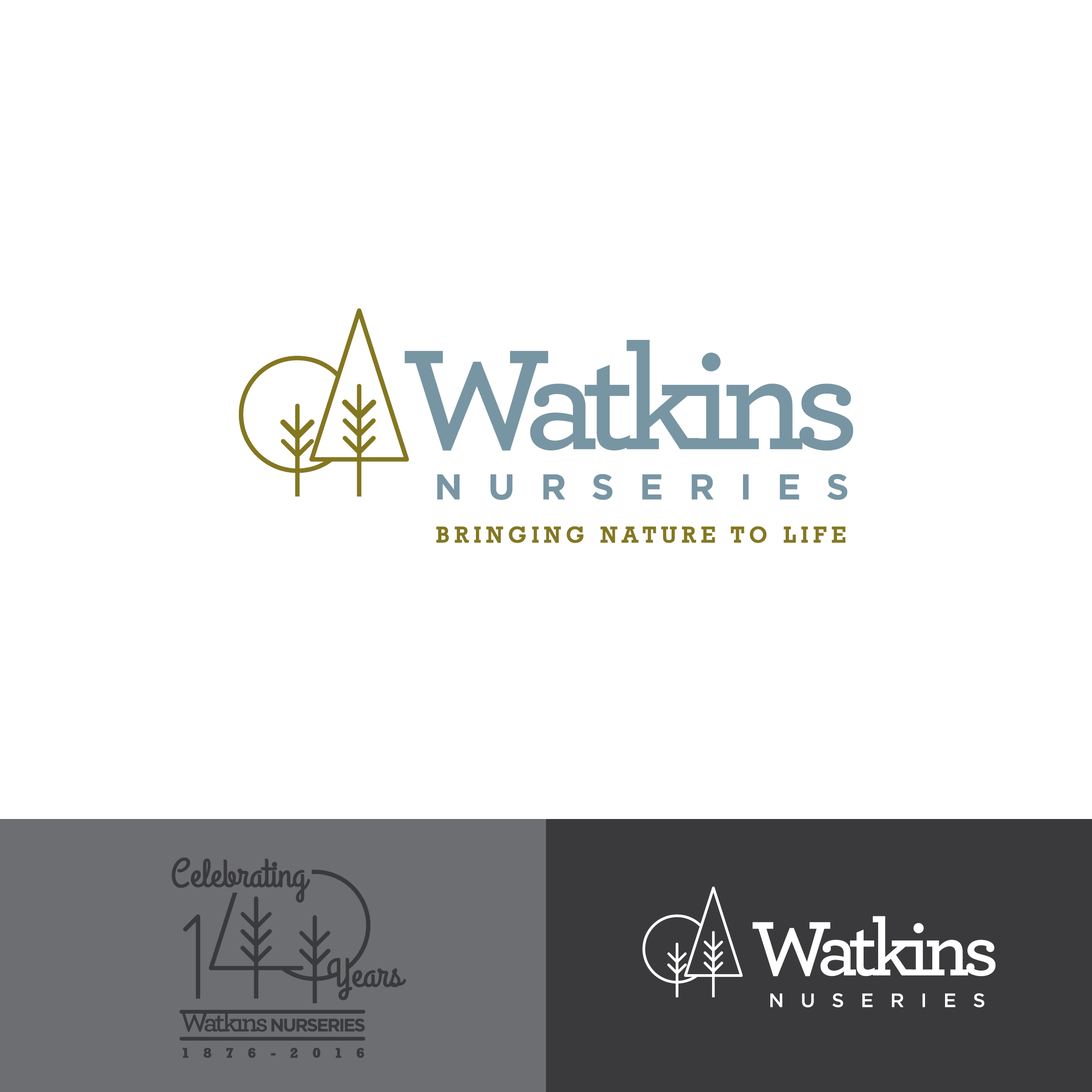
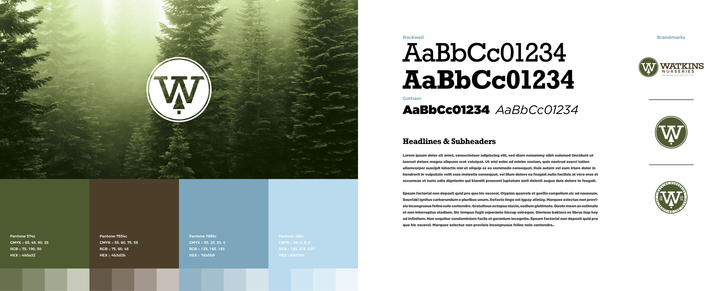
Watkins Nurseries
Logo development
Concept 1: Three Trees
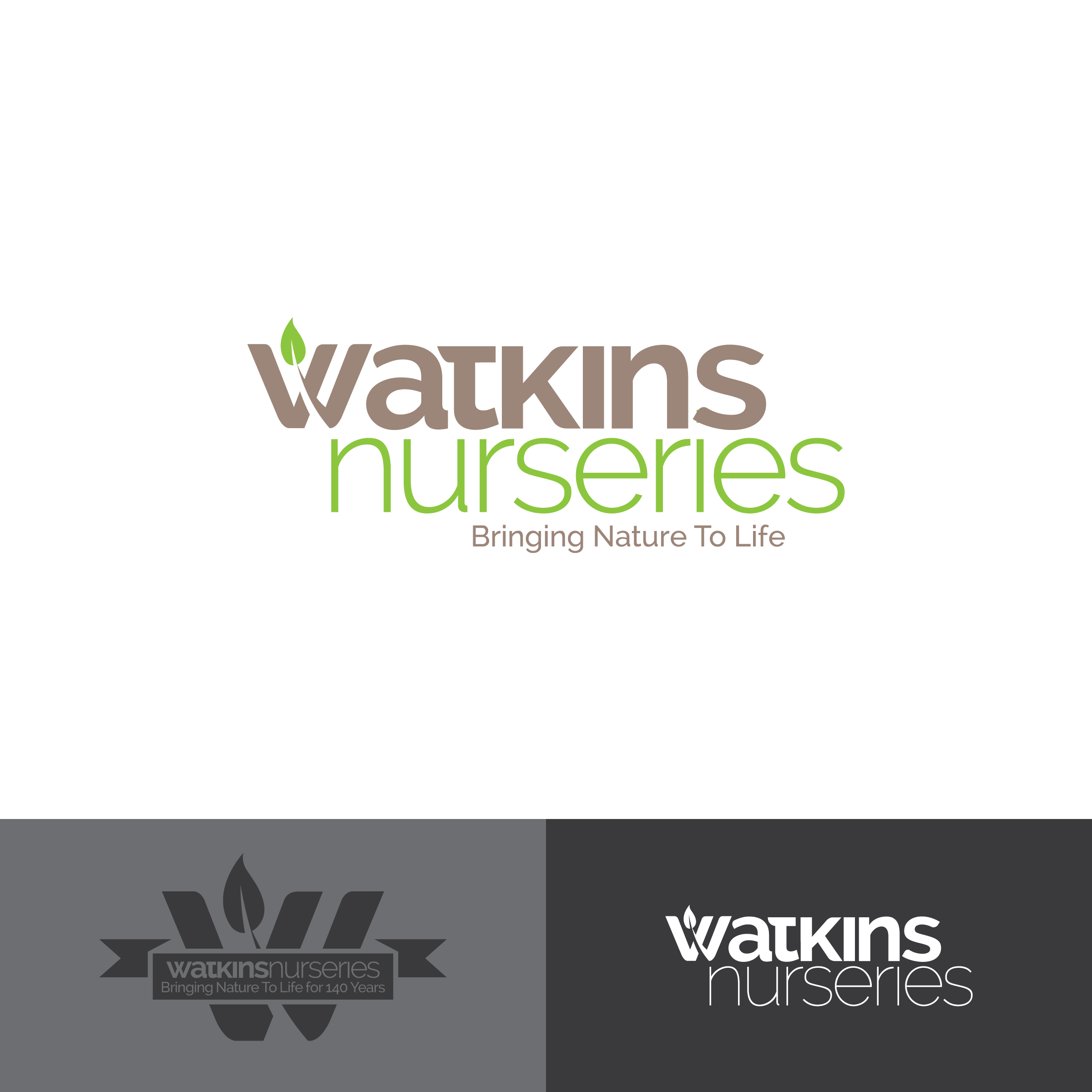
Concept 2: Grow With Us
Concept 3: Parks & Rec
Brand Guidelines
The client went with the simple, bold icon, which has three trees subtly placed within the 'W's negative space. We also created a '140 Year Anniversary' version.
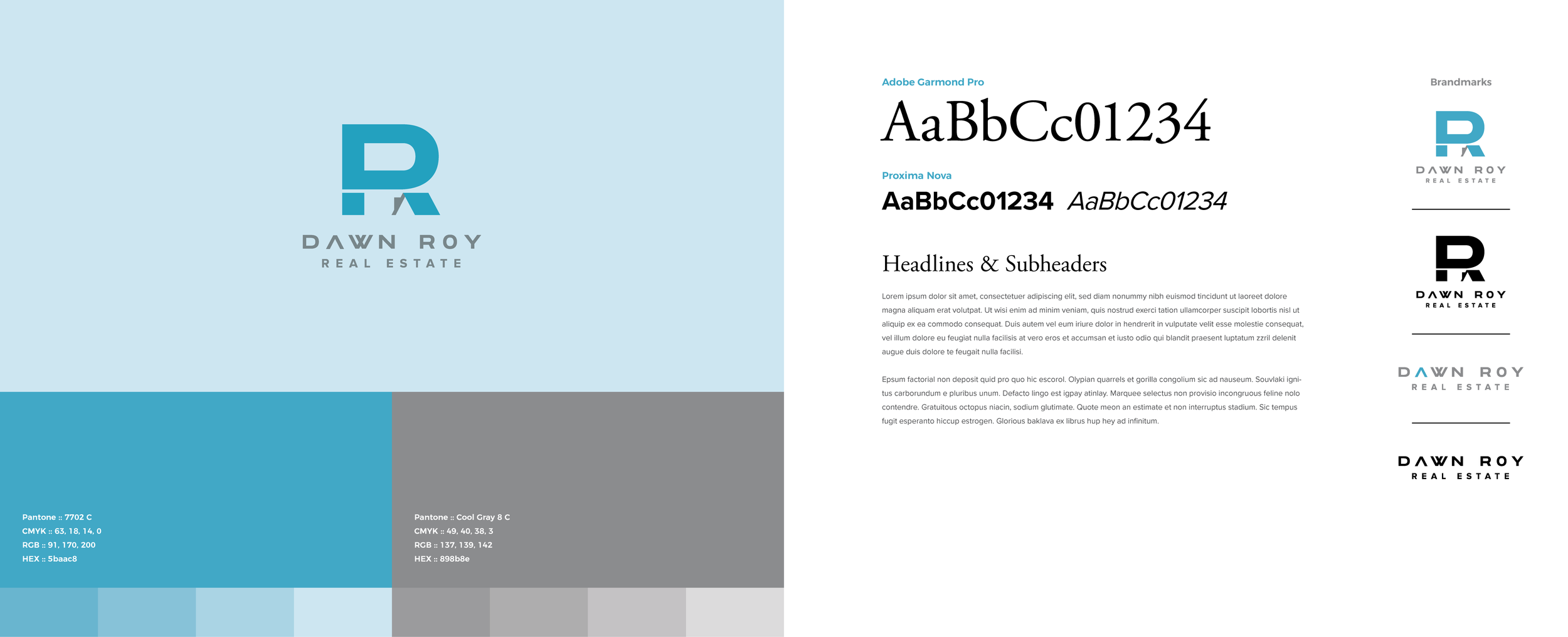
Dawn Roy Real Estate
Logo & Brand Guidelines
Because of our limited project budget, we created a single logo concept for our client. Fortunately she loved it.